Introduction
As 2019 has come to an end and we are well into a new decade, 2020, the world
has been attempting to cope and respond to a wide spread outbreak of a new virus
causes the disease Covid-19, or the Coronavirus. From December, 2019, when the first
WHO. As the days continued to roll on the virus has continued to spread throughout
the globe with it eventually being labelled an international public health emergency
by the WHOby the end of January 2020 had fell upon us. From that point the amount
of confirmed Covid-19 cases continued to escalate at throughout the world at various
levels, from as low as municipal to has high as national regions being impacted as a
consequence. With no end in sight at the time the situation was re-evaluated and
responses at all levels as all countries enacted individual actions and guidelines to
try and curb the amount of cases both entering their country from outside sources
and stopping new contact transmitted cases inside their own borders.
However, as a lifelong citizen of Canada it is there that I choose to focus my
own personal lens of data analysis for this blog. Because of my personal connections
the actions and responses enacted by the federal, provincial and even local
government bodies to curb the spread of the Coronavirus are of a more personal note.
To that point, the federal government has enacted numerous responses to this ongoing
coming into the country. As a recent transplant citizen to Halifax in Nova Scotia restaurants
been enacted. However, as we are now well into the month of June things have
continued to evolve as society attempts to adapt and overcome the virus whilst striving
to aim to a return to norm. Such an example is that as of Friday June 5th, 2020 restaurants
in Halifax have reopened under strict health and safety measures to try and prevent the
rise of new cases appearing.
This blog aims to ask several questions over the past half year or so surrounding
several topics surrounding the Coronavirus on a national level as well as at a
provincial level, as the data available to the public allows to be asked at this stage.
Some of these include questions surrounding who are the people in Canada being
most directly affected by the virus in terms of infections, where have been the most
cases, as of present day where are the newest cases appearing? Was Halifax
loosening of restrictions too soon of an action to have been taken? Also how has the
result of Canada’s response to the pandemic compare to the United States of America’s
(USA) as the only country Canada shares a physical border with.
The Data
How Many New Cases in Canada?
For this analysis several different datasets were chosen from multiple
sources as both to glean as much information as possible for prosperities sake as well
as to verify if the different sources that shared similar classifiers had similar data for
accuracies sake. The first dataset used is dataset based on a global distribution of
also known as the ECDC, which is an agency of the European Union. While this dataset
doesn’t go into depth of the pandemic by a case by cases level allows one to examine
the tally and trends of cases on a national level, in this instance focusing on Canada.
From figure one below we can watch the timeline of new cases being reported in
Canada and attempt to glean any information.
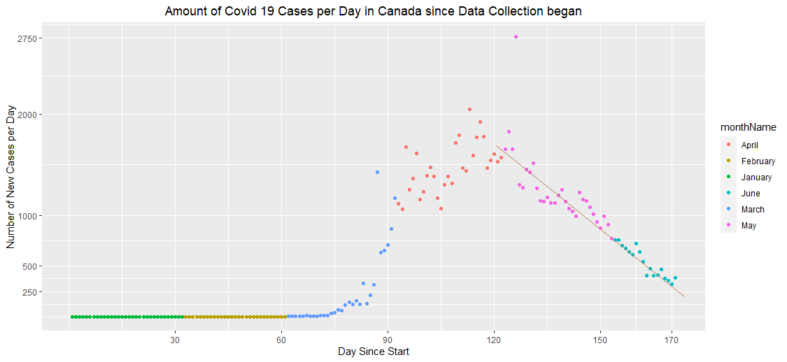
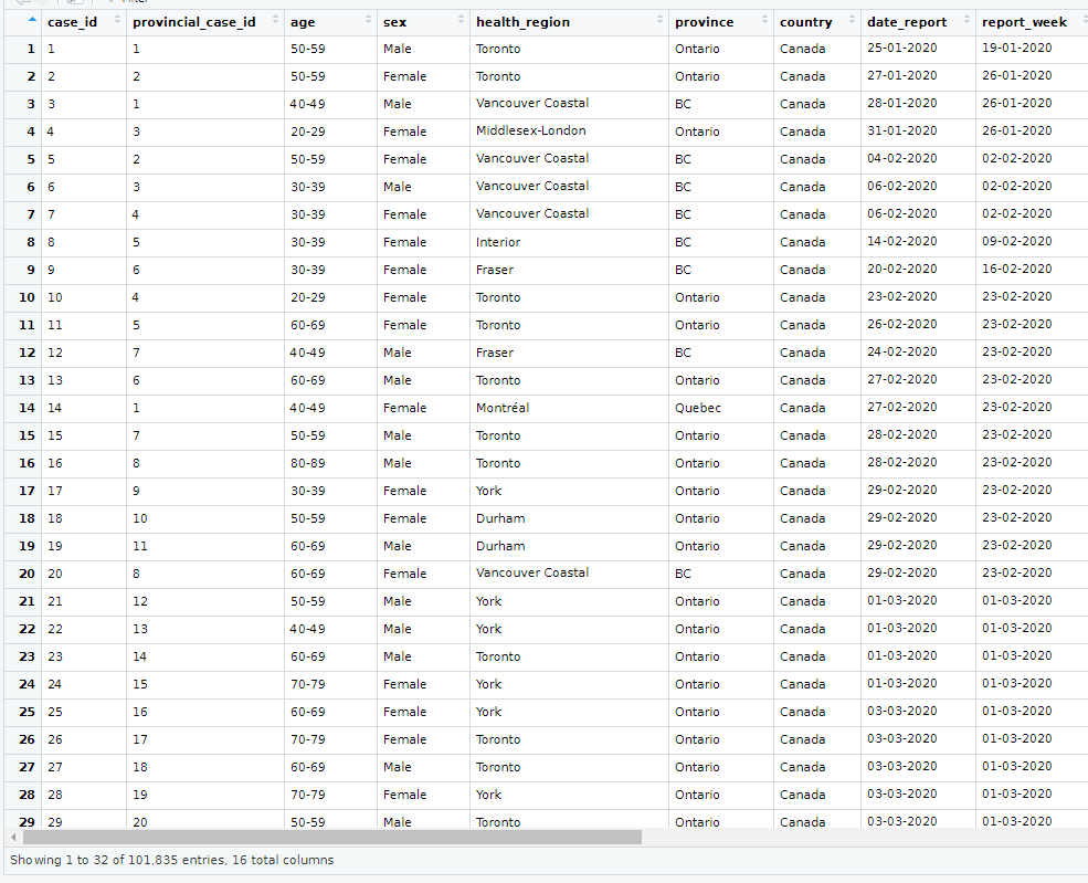
Figure 1: New Cases Reported by Day in Canada
From figure one we have a scatter plot detailing the number of new cases as reported
on a day by day basis from when data collection was first being recorded by the ECDC
which in the data starts at the 31st of December in 2019. The months have been colour
coded to better separate the time line within Canada, from the plot the outbreak of
cases only began approximately halfway through the month of May, the number of
new cases grew at an exponential level until peaking at approximately the end of April,
though there is one outlier data point noted at the beginning of May where a far
larger number of cases was reported. From here Canada has seen an almost perfect
linear fit curve of the number of new cases decreasing throughout May and June so
to reaching a current number of new cases country wide of approximately 300,
which when compared to the peak of approximately 2000 new cases per day is a
decrease of 666 percent, almost devilish in nature.
Can we predict when it will end?
Figure 2:Trendline of New Cases Per day in Canada through April-June 2020
Based on the current trendline extracted from the ECDC data of new cases reported per day
throughout Canada from April to the present day provides a linear regression model, an
equation with an initial intercept value coefficients relating to the average number of new cases
seen at the beginning of April 2020 at approximately 1852 and decreasing at a rate of 15 cases
per day. At that rate in another month Canada would have approximately 470 new cases per day
and ten days later it would be near zero. Based on this model we would at approximately 667
new cases reported in Canada, however based on actual numbers at this point we are doing
slightly better than the model predicted. This takes into account the R-Squared value for the
model which in this instance was approximately 0.54. so, there was some room for error. Based
on the model at the current rate of progression we can expect Canada as a whole to have no new
cases by the end of July.
Which Demographics Have Been Impacted?
Using additional datasets which shine more focus on Canada,
specifically where are the majority of the Coronavirus cases and which groups of
people have been reported as positive cases the most frequently? The second
aims to share information related to the ongoing Covid-19 pandemic within Canada.
The image two below highlights the demographics of positive reported Covid-19 cases
by province the person lives in.
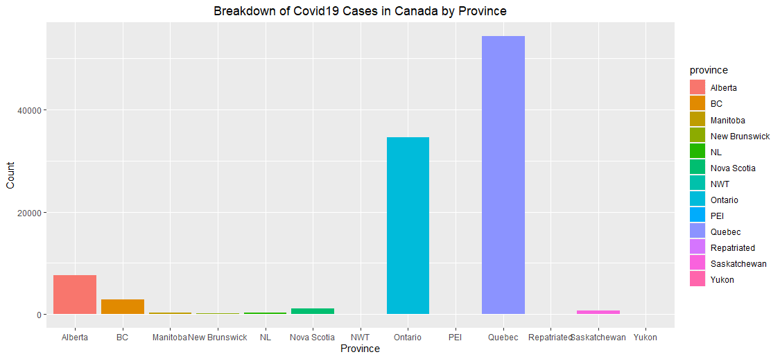
Figure 3: Breakdown of Confirmed Covid19 Cases by Province
From figure three we can see that the majority of confirmed positive cases of
Coronavirus within Canada have come from central Canada, specifically Ontario
and Quebec, while the next highest number of cases in Canada came from the
west coast, specifically Alberta then British Columbia respectively and fifthly is
Nova Scotia, though at a far lower rate than the other provinces above it. Figure
four below highlights the breakdown of gender demographics of reported positive
cases with a known gender identity.

Figure 4: Breakdown of Known Confirmed Positive Covid-19 Cases by Gender
From the pie chart above we can see that from the data of confirmed Covid-19
cases within Canada where the gender of the person is known there is an
approximately 55 percentage of their gender being female rather than male. This is a
slightly higher ratio than the population breakdown of Canada according to Statistics
Canada, as of 2014 women make 50.4 percent of the population. This slightly higher
infection rate among women compared to their population percentage could possibly
that sees a 92.2 percent majority female filled field.
Another demographic classification that positive cases of Covid-19 can be broken
down into is age groups. Figure four below is a bar plot showing the confirmed positive
Covid-19 cases within Canada as broken down by known age group.
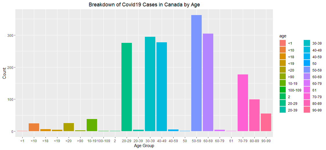
Figure 5: Breakdown of Covid19 Cases in Canada by Age Group
From figure five above we can see that the 50 to 59 age group leads in terms of
positive cases of Covid-19 as reported in Canada with approximately 360 cases out
of the 1961 known age group population size from the dataset, which is
approximately 18.3 percent of the total. Several age groups: 20-29, 30-39 40-49 and
60-69 also share close rates which demonstrates that the virus doesn’t discriminate
when it comes to age, these groups range from sample sizes of approximately 275 to
305 people out of the 1961 sample data, close to 14.5 percent of the total each.
From this data we could postulate that the reason for children and teenagers being so
lowly reported may be due to the symptoms of the illness being less pronounced in
that age group and went ignored and undiagnosed.
Predictor of Canada compared to the Rest of America?
Whilst looking at how case rates in Canada are trending it’s nice now and then to
look at how Canada is also faring on an international level. For this instance that
chosen level is the countries within continent of America that have still shown a
relatively high rate of new Covid-19 cases being reported on a day to day basis. In this
dataset from the ECDC the countries which fell into these criteria are Argentina, Brazil,
Canada, Chile, Columbia. Ecuador, Mexico, Peru, and the United States of America.
Figure six below is a scatter plot of these countries’ cases per day over the span of
what is June so far.
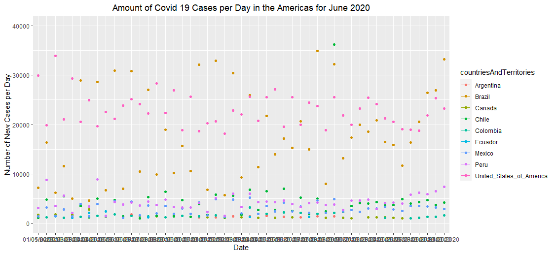
Figure 6: Amount of New Covid19 Cases per Day by Country in June 2020
From the plot in figure six we can see from the number of new cases per date there both
areas where the various countries have their on unique region separated from the other
countries on the plot though there are also areas of overlap which would suggest needing
more than just a comparison of one variable to be able to distinctly predict with confidence.
This is where a multivariable model comes into play, using the “best” and forward methods
to determine which variable should be selected as the model increases in complexity. After
this is done the dataset is split into a chosen amount of folds of data based on the number of
models being tested and the error bars can be compared to see how best the model
compares to the null method of guessing. For this dataset the prediction would involve
predicting the classification of each value, in this case which country the number of cases per
day belongs to. The null method of prediction would be tallying up the dataset and for
whichever class has the most rows present, for this data Mexico, Brazil and the United States
all share 49 rows each out of 307 total rows of data for 15.9 percent. If we were to pick any
one of those three countries and predict each time, we would be correct approximately 16
percent of the time. The figure seven below is a plot of five models, each model increasing
in complexity per iteration that is predicting the countries based on the predictors in the data.
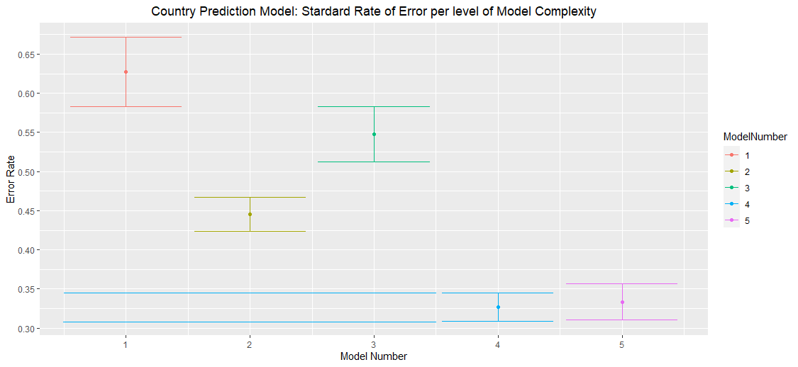
Figure 7:Standard Error Rate of Prediction Model
Based on the figure above we can see that model complexity four provides the lowest
standard error rate, by the one standard rule the upper and lower bars of model four are
extended back to check if the average error rate of any less complex model falls within the
error bars. In this plot none of them so model four is the least complex yet most accurate
model that would be chosen to work with. In this instance the model has an average error
rate of approximately 0.325 with an upper error bar of .35 and a lower of .3 respectively.
This corresponds to successfully predicting the correct Country based on the information
given approximately 67.5 percent of the time, over four times more accurate than the null
selector method.
What Lies in the Future for Nova Scotia?
While I was unable to find an available dataset of cases focused more locally on Halifax
Nova Scotia has now been ten days without a newly confirmed case of Covid-19. However, at
this time we are also reaching the two weeks since restrictions on restaurants were loosened.
This is the time frame where new cases if they have occurred should begin to emerge, will
Halifax and Nova Scotia regret their decisions to ease up on closedowns? That still remains
to be seen.
Appendices
Appendix 1: RStudio Code
library(tidyverse)
library(leaps)
library(ggplot2)
library(ISLR)
library(MASS)
id2 = seq(171, 1, by=-1)
Covidglobal <- read.csv("https://opendata.ecdc.europa.eu/covid19/casedistribution/csv", na.strings = "", fileEncoding = "UTF-8-BOM")
Covidglobal2 = filter(Covidglobal, geoId == "CA")
Covidglobal2b = mutate(Covidglobal2, id2)
Covidglobal2c = mutate(Covidglobal2b, monthName =
ifelse(grepl("1", month), "January",
ifelse(grepl("2", month), "February",
ifelse(grepl("3", month), "March",
ifelse(grepl("4", month), "April",
ifelse(grepl("5", month), "May",
ifelse(grepl("6", month), "June", 0)))))))
Covidglobal3 = filter(Covidglobal, month > 3, year == 2020, geoId == "US" | geoId == "CA")
CovidCanadaAprMay = filter(Covidglobal2c, month == 4 | month == 5 | month == 6)
idCan = seq (79, 1, by=-1)
CovidCanadaAprMay2 = mutate(CovidCanadaAprMay, idCan)
Covid1000 = filter(Covidglobal, month > 4, cases > 1000, continentExp == "America")
Covid1000b = mutate(Covid1000, Country =
ifelse(grepl("Brazil", countriesAndTerritories), 1,
ifelse(grepl("Canada", countriesAndTerritories), 2,
ifelse(grepl("Chile", countriesAndTerritories), 3,
ifelse(grepl("Mexico", countriesAndTerritories), 4,
ifelse(grepl("Peru", countriesAndTerritories), 5,
ifelse(grepl("Argentina", countriesAndTerritories), 6,
ifelse(grepl("Columbia", countriesAndTerritories), 7,
ifelse(grepl("Ecuador", countriesAndTerritories), 8,
ifelse(grepl("United_States_of_America", countriesAndTerritories), 9, 0))))))))))
CovidESRI <- read.csv("https://opendata.arcgis.com/datasets/4dabb4afab874804ba121536efaaacb4_0.csv", na.strings = "", fileEncoding = "UTF-8-BOM")
CovidESRI2 = mutate(CovidESRI, id = row_number())
CovidESRI2b = slice(CovidESRI2, sample(1:n()))
CovidESRI3 = sample_frac(CovidESRI2b, .1)
Canada <- read.csv("https://github.com/ishaberry/Covid19Canada/raw/master/cases.csv", na.strings = "", fileEncoding = "UTF-8-BOM")
CanadaGender = filter(Canada, sex == "Female" | sex == "Male")
CanadaAge = filter(Canada, age != "Not Reported")
#plotting Datasets
attach(Covidglobal)
theme_update(plot.title = element_text(hjust = 0.5))
#plotting trendline in Canada vs United States
ggplot(data = Covidglobal3)+
geom_point(mapping = aes(x = day, y = cases, colour = countriesAndTerritories))+
facet_wrap(vars(factor(countriesAndTerritories)))+
ylab("Number of New Cases per Day")+
xlab("Date")+
ggtitle("Amount of Covid 19 Cases per Day for May 2020")+
geom_smooth(method = "lm", aes(x = day, y = cases))
#plotting trendline in Canada
ggplot(data = CovidCanadaAprMay2)+
geom_point(mapping = aes(x = idCan, y = cases, color = monthName))+
ylab("Number of New Cases per Day")+
xlab("Day")+
ggtitle("Amount of Covid 19 Cases per Day for Spring 2020 in Canada")+
geom_smooth(method = "lm", aes(x = idCan, y = cases))
#plotting trendline in Canada vs United States
ggplot(data = Covidglobal2c)+
geom_point(mapping = aes(x = id2, y = cases, color = monthName))+
ylab("Number of New Cases per Day")+
xlab("Day Since Start")+
ggtitle("Amount of Covid 19 Cases per Day in Canada since Data Collection began")+
scale_x_continuous(breaks = c(30, 60, 90, 120, 150, 170))+
scale_y_continuous(breaks = c(250, 500, 1000, 2000, 2750))
#plotting demographics of Covid19 in Canada
attach(CovidESRI)
ggplot(Covidglobal2c, aes( x = "", y=cases, fill = monthName))+
geom_bar( stat="identity")+
xlab("Month")+
ylab("Frequency")+
ggtitle("Number of Covid19 Cases in Canada by Month")+
coord_polar("y", start = 0)
attach(Canada)
ggplot(Canada2, aes( x = "", y="", fill = province))+
geom_bar( stat="identity")+
xlab("Province")+
ylab("Frequency")+
ggtitle("Number of Covid19 Cases in Canada by Province")+
coord_polar("y", start = 0)
ggplot(CanadaGender, aes( x = "", y="", fill = sex))+
geom_bar( stat="identity")+
xlab("Gender")+
ylab("Frequency")+
ggtitle("Number of Covid19 Cases in Canada by Gender")+
coord_polar("y", start = 0)
ggplot(data=CanadaAge)+
geom_bar(mapping=aes(x=age, fill = age))+
xlab("Age Group")+
ylab("Count")+
ggtitle("Breakdown of Covid19 Cases in Canada by Age")
ggplot(data=Canada)+
geom_bar(mapping=aes(x=province, fill = province))+
xlab("Province")+
ylab("Count")+
ggtitle("Breakdown of Covid19 Cases in Canada by Province")
#plotting Countries
ggplot(data = Covid1000b)+
geom_point(mapping = aes(x = dateRep, y = cases, colour = countriesAndTerritories))+
ylab("Number of New Cases per Day")+
xlab("Date")+
ggtitle("Amount of Covid 19 Cases per Day in the Americas for June 2020")+
ylim(0,40000)+
geom_line(aes(x = dateRep, y = cases, colour = countriesAndTerritories))
ggplot(data=Covid1000b)+
geom_bar(mapping=aes(x=countriesAndTerritories, fill = countriesAndTerritories))+
xlab("Country")+
ylab("Count")+
ggtitle("Breakdown of Covid19 Cases in Canada by Age")
#linear regression
Covidglobal2d = filter(CovidCanada, month > 4, cases < 2000)
Cases3 = lm(data = CovidCanadaAprMay2, cases~idCan)
#cases2 = lm(data = CovidCanadaMay, cases~poly(day,2), raw=TRUE)
summary(Cases3)
#predicitonModel k-fold cross validation with best
CountryMix = slice(Covid1000b, sample(1:n()))
id3 = seq(1, 307, by=1)
CountryRand = mutate(CountryMix, id3)
CountryRand2 = dplyr::select(CountryRand, countriesAndTerritories, day, cases, month, deaths, Country, id3)
bestCountry = regsubsets(Country~+poly(deaths, 3)+poly(day,3)+poly(cases,3)+id3+month,data=CountryRand2, nvmax = 10)
summary(bestCountry)
summary(bestCountry)$rsq
coef(bestCountry, 1)
coef(bestCountry, 2)
coef(bestCountry, 3)
coef(bestCountry, 4)
coef(bestCountry, 5)
coef(bestCountry, 6)
#model 1 deaths
#model 2 poly(cases, 3) + deaths
#model 3 poly(cases, 2) + cases + poly(cases, 3)
#model 4 poly(deaths, 2) + cases + poly(cases, 2) + poly(cases, 3)
#model 5 poly(deaths, 2) + deaths + cases + poly(cases, 2) + poly(cases, 3) + month
#model 6 poly(deaths, 2) + poly(deaths, 3) + day + cases + poly(cases, 2) + poly(cases, 3)
#automate the process
k = 5
numRows = nrow(CountryRand2)
errorsCountry5 = rep(0, k)
totalErrorCountry = 0
for(i in 1:k){
testCountry = filter(CountryRand2, id3 >= (i-1)*numRows/k+1 & id3 <= i*numRows/k)
trainCountry = anti_join(CountryRand2, testCountry, by="id3")
modelCountry = lda(countriesAndTerritories~poly(deaths, 2) + deaths + month + cases + poly(cases, 2) + poly(cases, 3), trainCountry)
modelCountryGuess = predict(modelCountry, testCountry)
errorsCountry5[i] = 1 - mean(modelCountryGuess$class == testCountry$countriesAndTerritories)
totalErrorCountry = errorsCountry5[i] + totalErrorCountry
}
errorsCountry1
avgE = rep(0,k)
for (i in 1:k){
avgE[1] = errorsCountry1[i]+avgE[1]
avgE[2] = errorsCountry2[i]+avgE[2]
avgE[3] = errorsCountry3[i]+avgE[3]
avgE[4] = errorsCountry4[i]+avgE[4]
avgE[5] = errorsCountry5[i]+avgE[5]
}
#calculating average errors
#calculating std/deviation errors, then strd errors
se = rep(0,k)
for (i in 1:k){
avgE[i] = avgE[i]/k
}
se[1] = sqrt(var(errorsCountry1)/k)
se[2] = sqrt(var(errorsCountry2)/k)
se[3] = sqrt(var(errorsCountry3)/k)
se[4] = sqrt(var(errorsCountry4)/k)
se[5] = sqrt(var(errorsCountry5)/k)
#create model numbers and data frame
mnCountry = seq(1,5, by=1)
cvCountry = data.frame(avgE, se, mnCountry)
CVCountry2 = mutate(cvCountry, ModelNumber =
ifelse(grepl("1", mnCountry), "1",
ifelse(grepl("2", mnCountry), "2",
ifelse(grepl("3", mnCountry), "3",
ifelse(grepl("4", mnCountry), "4",
ifelse(grepl("5", mnCountry), "5", 0))))))
#plotting the data
ggplot(data = CVCountry2, aes(x = mnCountry, y = avgE, color = ModelNumber))+
geom_line()+
geom_point()+
geom_errorbar(aes(ymin = avgE-se, ymax = avgE+se))+
xlab("Model Number")+
ylab("Error Rate")+
ggtitle("Country Prediction Model: Stardard Rate of Error per level of Model Complexity")+
scale_y_continuous(breaks = c(.30,.35, .40, .45, .5, .55, .6, .65))
Appendix 2: Sample Datasets
Dataset 1: ECDC
Dataset 2: Dalla Lana School of Public Health